POSTS
Intro to rtweet: Analyzing Airline's Social Media Engagement
I mentioned in another post about the importance of airlines connecting with passengers. A major aspect of that is the method of communication leveraged by the firm. Social media has become the main medium of companies to engage with consumers. With the rise of social media, comes open source data to analyze interactions. Luckily, Twitter has a plethora of data available to its followers.
Twitter Analytics is great for companies to analyze the reach and the effectiveness of their tweets. Any account can access their basic Twitter Analytics dashboard, with Enterprise accounts able to access more in-depth metrics. But for those interested in a more DIY analysis looking across multiple accounts, Twitter allows people to easily access its REST API to pull various metrics from its site. This post outlines how you can extract and analyze airline Twitter data using R.
Connecting to Twitter API
I was able to connect to Twitter’s API and pull timeline information for 5 major US airlines using the package ‘rtweet’. The data includes tweets, favorites, retweets, time, locations and much more.
library(rtweet)
library(tidyverse)

accounts <- c('@delta', '@united', '@americanair', '@SouthwestAir', '@JetBlue')

tweets <- get_timeline(accounts, n= 3200, exclude_replies = TRUE, is_retweet = FALSE)
Just like that, we have Twitter data we can analyze. The get_timeline() function pulls the latest tweets based on the account parameters specified. In this case, I pulled the timeline from Delta, United, American, Southwest and JetBlue. The function is limited to the latest 3200 tweets per account, and considering the nature of how airlines mainly use their Twitter, the majority of the tweets are automated responses to people tagging the airline.
Therefore, we had to limit the data to “status tweets” which is original tweets by the airline that was not triggered as a reply or retweet of another tweet. This significantly lowered the amount of tweets and the timeline of tweets. For example, of the 3200 tweets by United Airlines, only 39 tweets were status tweets and pulled in for analysis. Due to these limitations, this post is not intended for actual insights, but merely an introduction to rtweet using real airline industry data.
Aggregating the Data
Next, we want to look at a tweet’s engagement. Engagement here is defined as favorites plus retweets. Replies and profile clicks were not included in the data pull, so they are not used for this analysis, but would generally be included in an engagement metric. Similarly, the API call does not include impressions, or the number of times the tweet was seen by a Twitter user, so we will be using follower count in determining engagement rates.
engagement <- tweets %>%
  mutate(engagement = favorite_count + retweet_count) %>% #Create engagement metric
  group_by(screen_name) %>%
  summarise(n = n(), #number of tweets
            min_date = min(created_at), #determine when the first tweet of the data was
                        tweets_per_day = n / (round(as.numeric(difftime(lubridate::today(),min(created_at))),0)), #Divide total tweets by range of days
            total_engagement = sum(engagement),
            avg_engagement = total_engagement/n,
            followers = max(followers_count), #number of followers for account at time of the get_timeline() pull
            engagement_rate = total_engagement/n / followers) %>% #engagement weighted by number of followers
  mutate(screen_name = ifelse(screen_name == 'united', 'United', screen_name)) #Change united to United
Making Sense of the Data
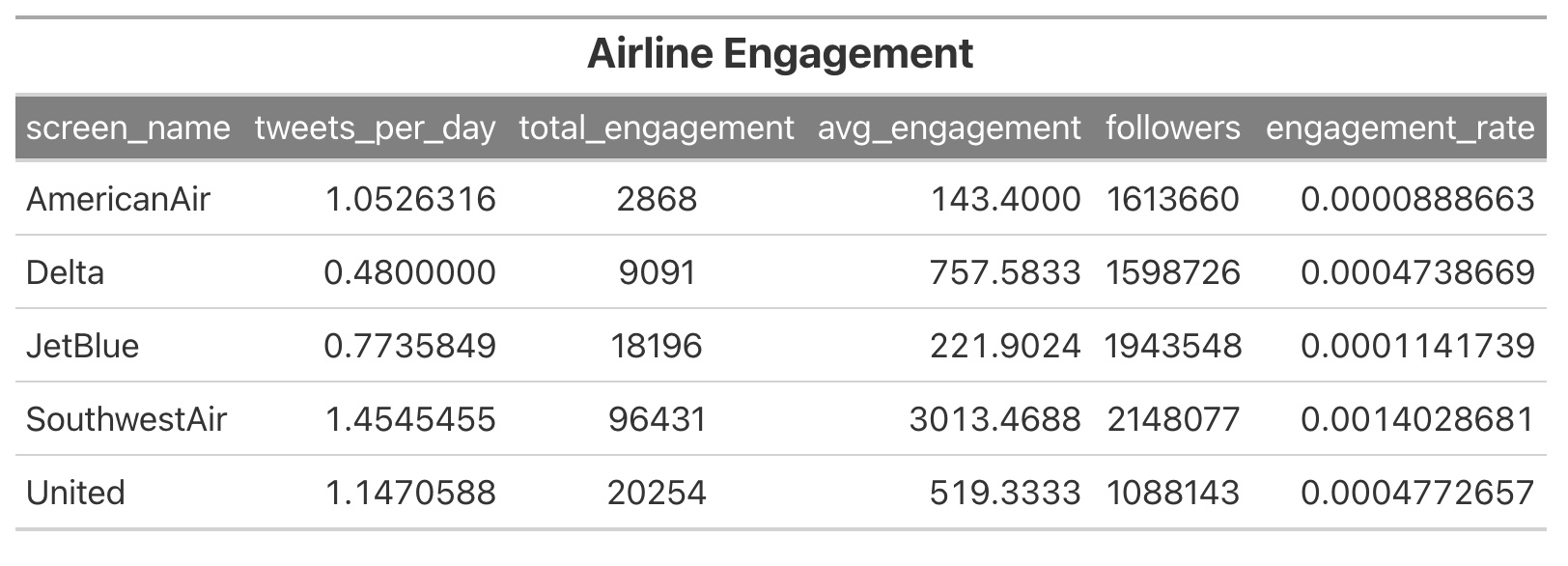
The first metric we create is the total number of tweets per account (variable “n”). Since we are limited to the most recent 3200 tweets, it is not accurate to say that an airline tweets more if they have more status tweets. It could be that they had many replies recently that made up the majority of the allotted tweets. In order to get a standard metric of tweet frequency, we take the timeline of the first and last tweet for each account and calculate tweets per day. Not perfect, but a better metric for identifying how often an airline does a status tweet.
Next, we calculate the engagement scores - average engagement and engagement rate. The former takes the average engagement per tweet. Engagement rate incorporates the number of followers per account (in lieu of impressions). Since the accounts have varying amounts of followers that could inflate other metrics, engagement rate allows us to see how effective the tweets are per follower.

Visualizing the Data
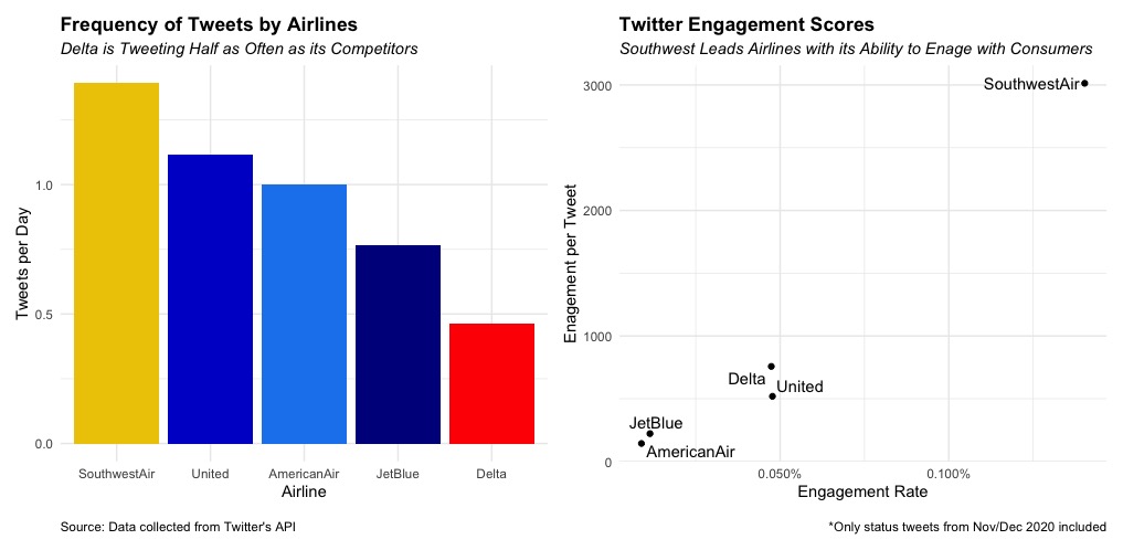
Using ggplot2, we can visualize the information that we just calculated to get a better understanding of how airlines compare to each other (see code for plot at the bottom of the post).

Based on the output, we see that Southwest does the most status tweets per day, while Delta significantly lags in terms of tweet frequency (they do have a separate Delta News Hub account that could account for the lower amount of tweets). Additionally, Southwest is far and away more effective in engaging twitter users in terms of both average engagement and engagement rate.
Conclusion
Obviously, this is a very limited analysis of Twitter data and does not provide reliable insights, but hopefully it provides a helpful introduction into using R to access the Twitter API and analyze the data. The rtweet documentation includes many more functions than pulling one account’s timeline so please check it out if this interests you. Taking this further, it would be interesting to explore more data and apply text mining or sentiment analysis to identify how the tweets are capturing engagement.
Please connect on LinkedIn or Twitter if you have any additional questions or suggestions!
#CREATING THE SIDE-BY-SIDE PLOTS ABOVE
library(ggplot2)
library(patchwork)

colors <- c('dodgerblue2', 'red', 'darkblue', 'gold2', 'blue3') #try and match color to the airline colors

g1<- ggplot(engagement, aes(x = reorder(screen_name, -tweets_per_day), y = tweets_per_day)) +
  geom_bar(position="identity", stat="identity", fill = colors) +
  xlab("Airline") +
  ylab("Tweets per Day") +
  theme_minimal() +
  theme(
    legend.title = element_blank(),
    legend.position = "bottom",
    plot.title = element_text(face = "bold"),
    plot.subtitle = element_text(face= "italic"),
    plot.caption = element_text(hjust = 0)) +
  labs(
    title = "Frequency of Tweets by Airlines",
    subtitle = "Delta is Tweeting Half as Often as its Competitors",
    # subtitle = "Status Tweets Only from Nov/Dec 2020 Timeframe",
    caption = "\nSource: Data collected from Twitter's API"
  )

g2 <- ggplot(engagement, aes(y = avg_engagement, x = engagement_rate,label = screen_name)) +
  geom_point() +
  ggrepel::geom_text_repel() +
  xlab("Engagement Rate") +
  ylab("Enagement per Tweet") +
  theme_minimal() +
  scale_x_continuous(labels = scales::percent_format()) +
  theme(
    legend.title = element_blank(),
    legend.position = "bottom",
    plot.subtitle = element_text(face= "italic"),
    plot.title = element_text(face = "bold")) +
  labs(
    title = "Twitter Engagement Scores",
    subtitle = "Southwest Leads Airlines with its Ability to Enage with Consumers",
    caption = "\n*Only status tweets from Nov/Dec 2020 included"
  )

g1 + g2  #patchwork to comnine plots